We’ve always loved Southend as a home of alternative culture – a place for ice cream and amusements on the promenade but also for its massive part in late 20th century music and fashion scenes – punk and rave and mod revivals – a proper melting pot for independent thinkers and creative minds. But sadly most of the time that’s not how Southend is seen externally, and those values of creativity, individuality and cheerful entertainment haven’t been celebrated enough for a positive image to cut through. As one resident put it – ‘when I went away to uni, I got sick of having to apologise about where I was from’. In late 2019, we won a competitive tender to create a place brand narrative, visual identity and website for the borough of Southend.
Work started in February 2020, and whilst it was made trickier by the pandemic, we’re really proud to have carried out extensive engagement and consultation remotely and produced a brand that amplifies all that is brilliant about Southend Southend borough spreads across 7 miles of coastline and emcompasses (at least) 5 different small towns – Leigh-on-Sea, Westcliffe, Southend Central, Thorpe Bay and Shoeburyness – each with their own identity. Whether you’re after contemporary visual art (Focal Point Gallery), Anglo Saxon History (Prittlewell), kitesurfing (East Beach) or just a really great ice cream (Rossi’s), Southend is one of the few places that truly can claim to have something for everyone.


Approach
Once we had developed the brand narrative through a co-design process with stakeholders and local creatives, we worked to transform Southend’s core values into a visual identity that could communicate its vibrancy, diversity and independence as a place.
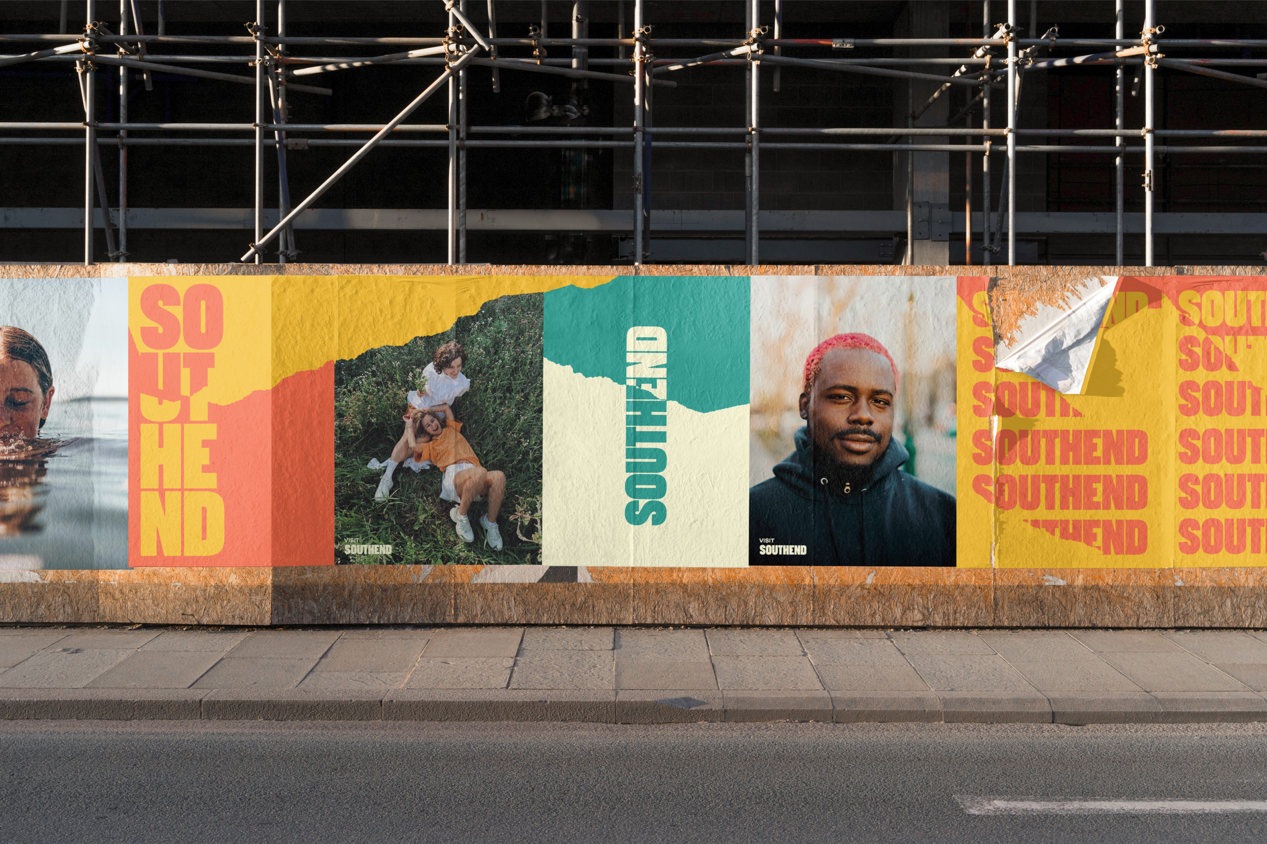
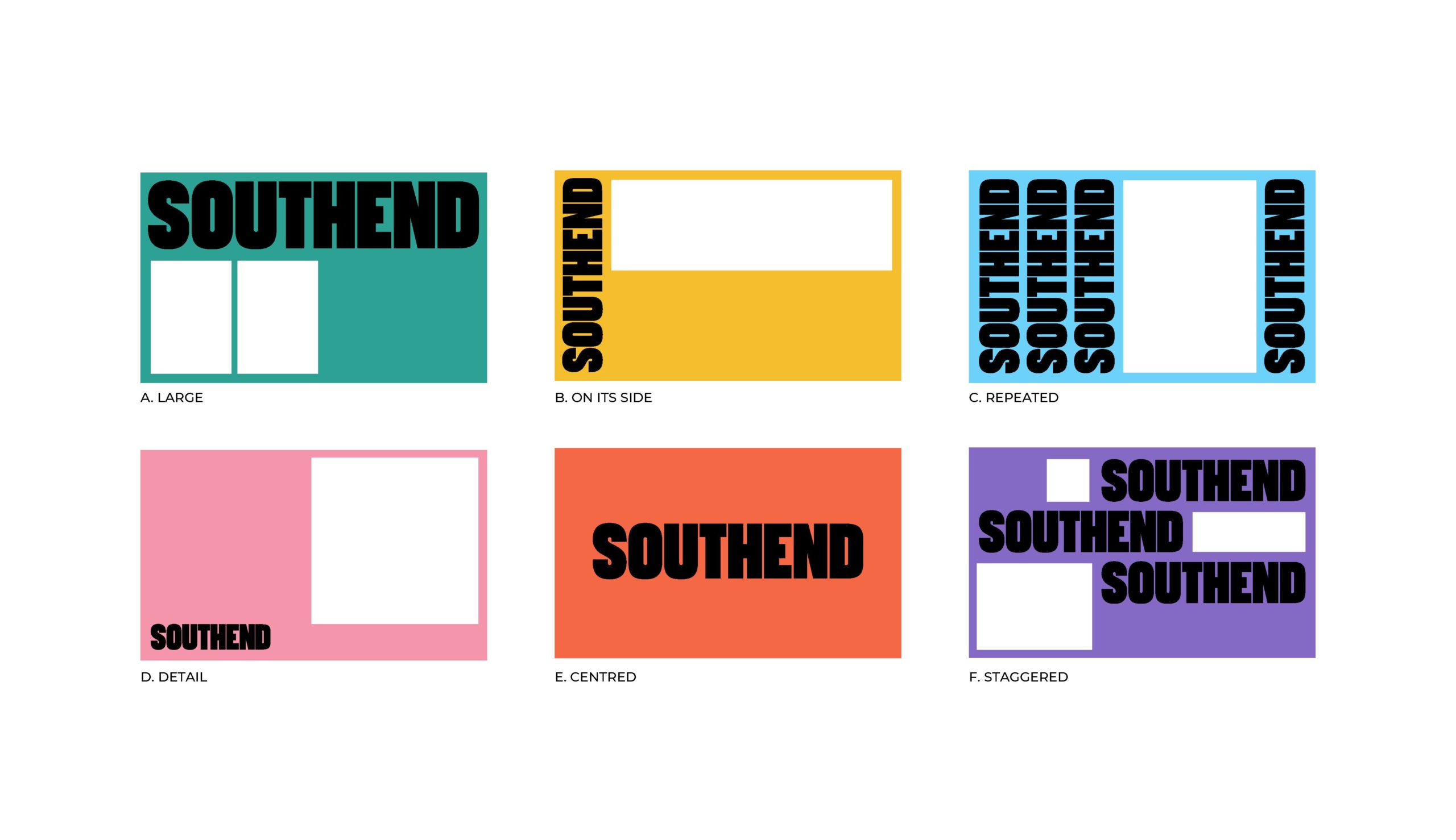
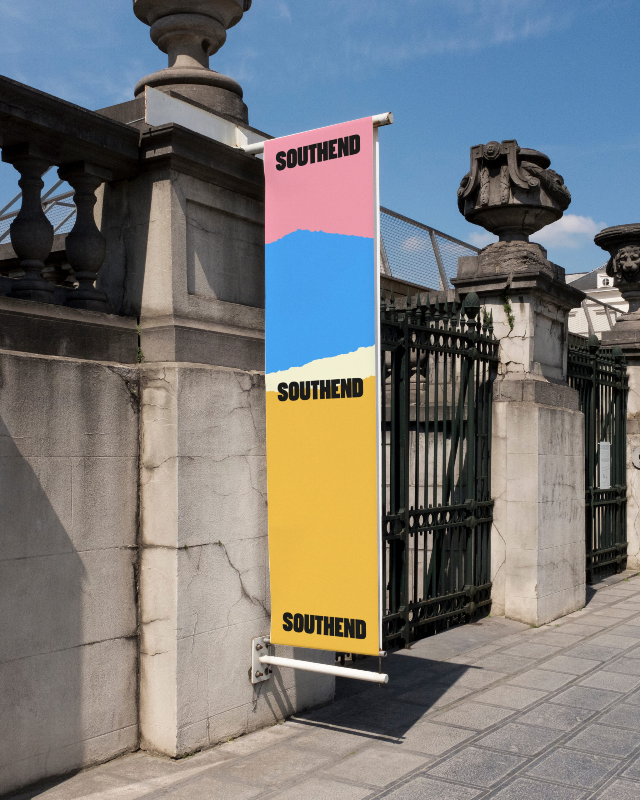
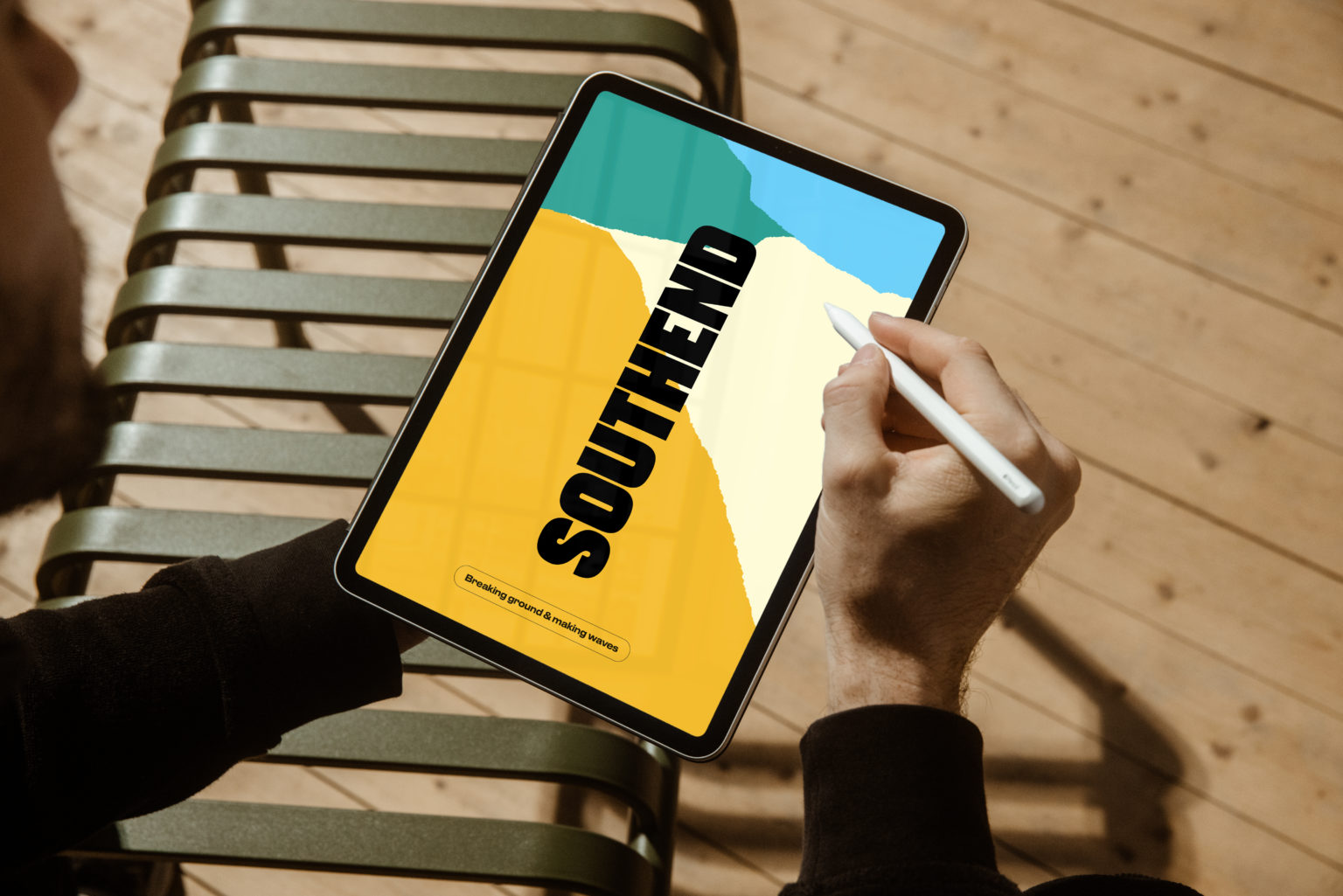
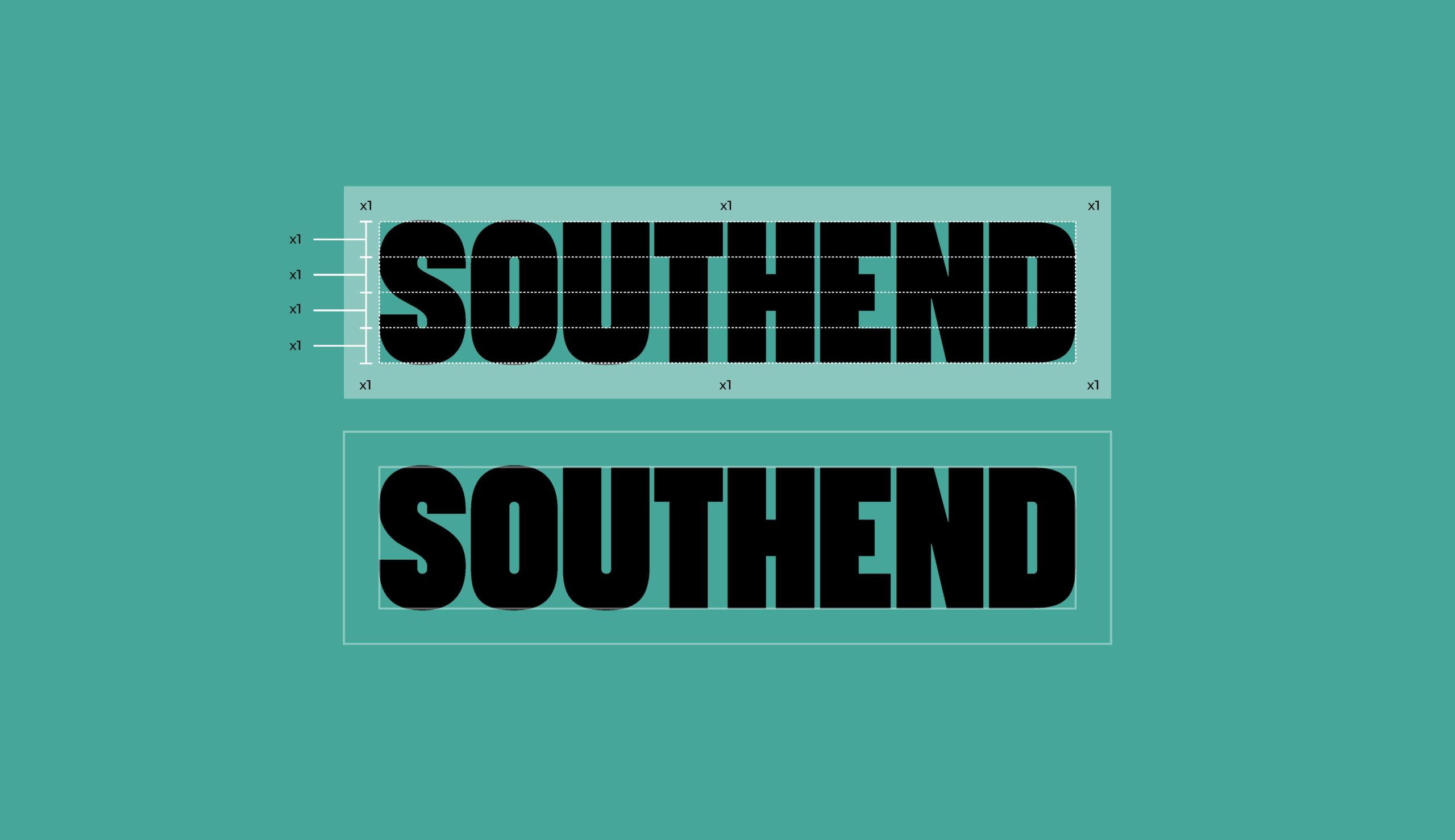
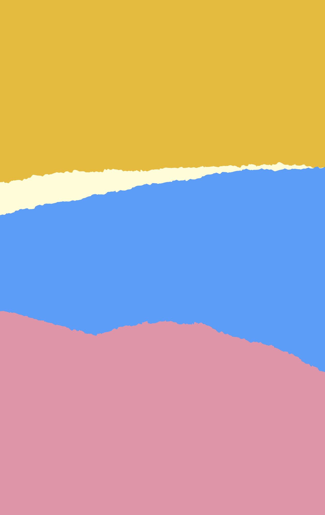
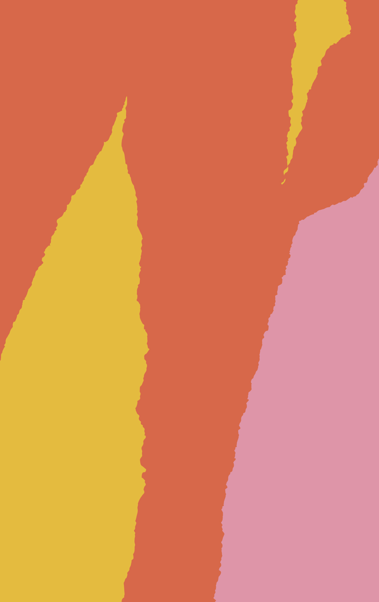
Our primary wordmark is simple yet bold – a stamp to proudly claim Southend’s rightful place as a centre of culture, with a narrow exclusion zone encouraging it to take up space in any application. The visual language uses a jagged line with a dual meaning – referencing Southend’s 7 miles of coast and the way the borough exists on the fringes of ‘ordinary’; the edgelands of Essex. The line creates a threshold – words and images disrupt its continuation, and the colour reverses out. Like Southend, this design doesn’t do what you’d expect it to.
A wide, bright palette plays to the nostalgia of seaside amusements with added references to blue skies, sandy beaches and surrounding greenery in punchy colours that are confident, bold and no-nonsense. With the tear device, clean and modern typefaces, full-throttle palette and photography mixed in, the elements come together to form a visual language that celebrates a place of layers, rawness and contrast.
