With 65% of the population now wearing second-hand, Traid wants to make it 100%.
To do so a more complete, contemporary identity was required. One that gave greater meaning to Traid’s brand, distinction to the visual presentation and dynamism to the brand activation; and to make the appeal of second-hand and charity retail even more inclusive.
The challenge was to transform an outdated brand identity into an expressive and engaging identity, reflective of Traid’s distinctive vision and values.
We undertook staff focus groups and customer surveying to gather insight helping us understand the depth and breadth of associations people hold of Traid, and of charity retail, and how this affects awareness and attitudes.
We learnt that Traid has a wide and loyal customer base –spanning ages and ethnicities – who choose to shop with Traid for a variety of reasons including style, sustainability and thrift. Whilst awareness about the issues Traid tackles, and causes/projects it supports and funds is limited, customers believe in, and are ready to be engaged in Traid’s mission. Customers would like to understand more about Traid’s work – the story behind the scenes – and to further their understanding about the impact of their fashion/clothing choices. They support the work of activists.
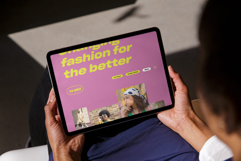
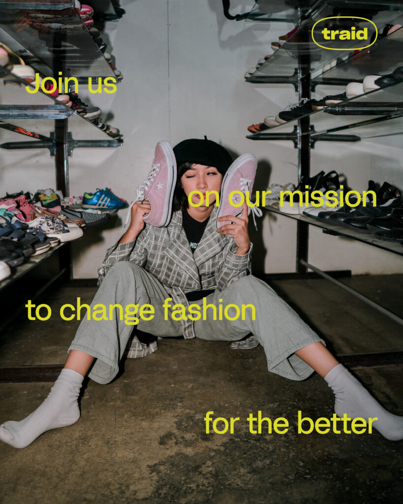
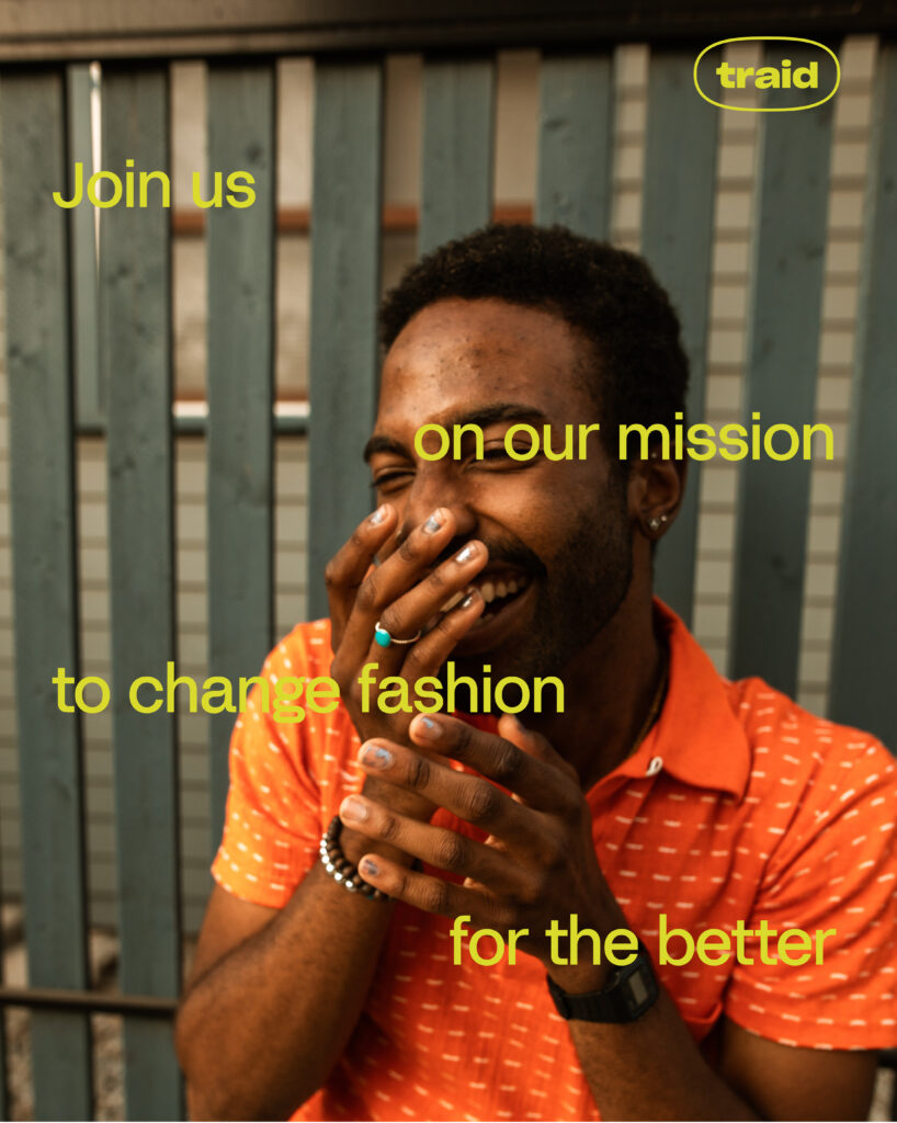
Working with Traid we have developed a brand with a bold, non-conformist and determined personality. Adopting an approach of ‘activism for all’ – subtle, joyful, and cool. Self-expression through style and clothes by doing good and helping others.
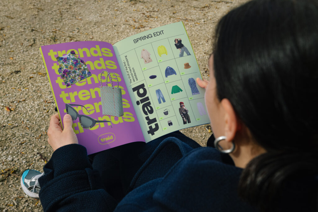
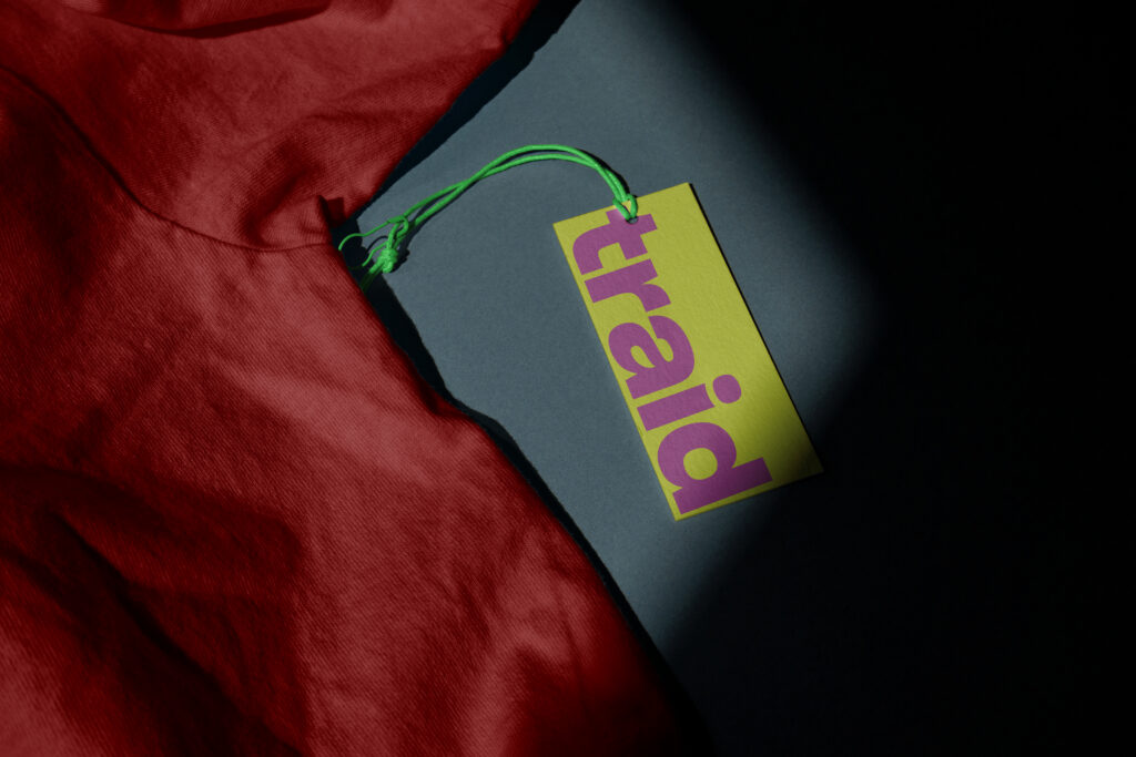
The visual identity refresh started with an evolution of the wordmark – drawing inspiration from historic Traid logos and typefaces.
We wanted a visual language with an impactful yet mature typographic direction. We have achieved this with a typeface that has strength, personality, a playful dynamism, and confidence that makes it noticeable. Encapsulating the exact spirit of the brand.
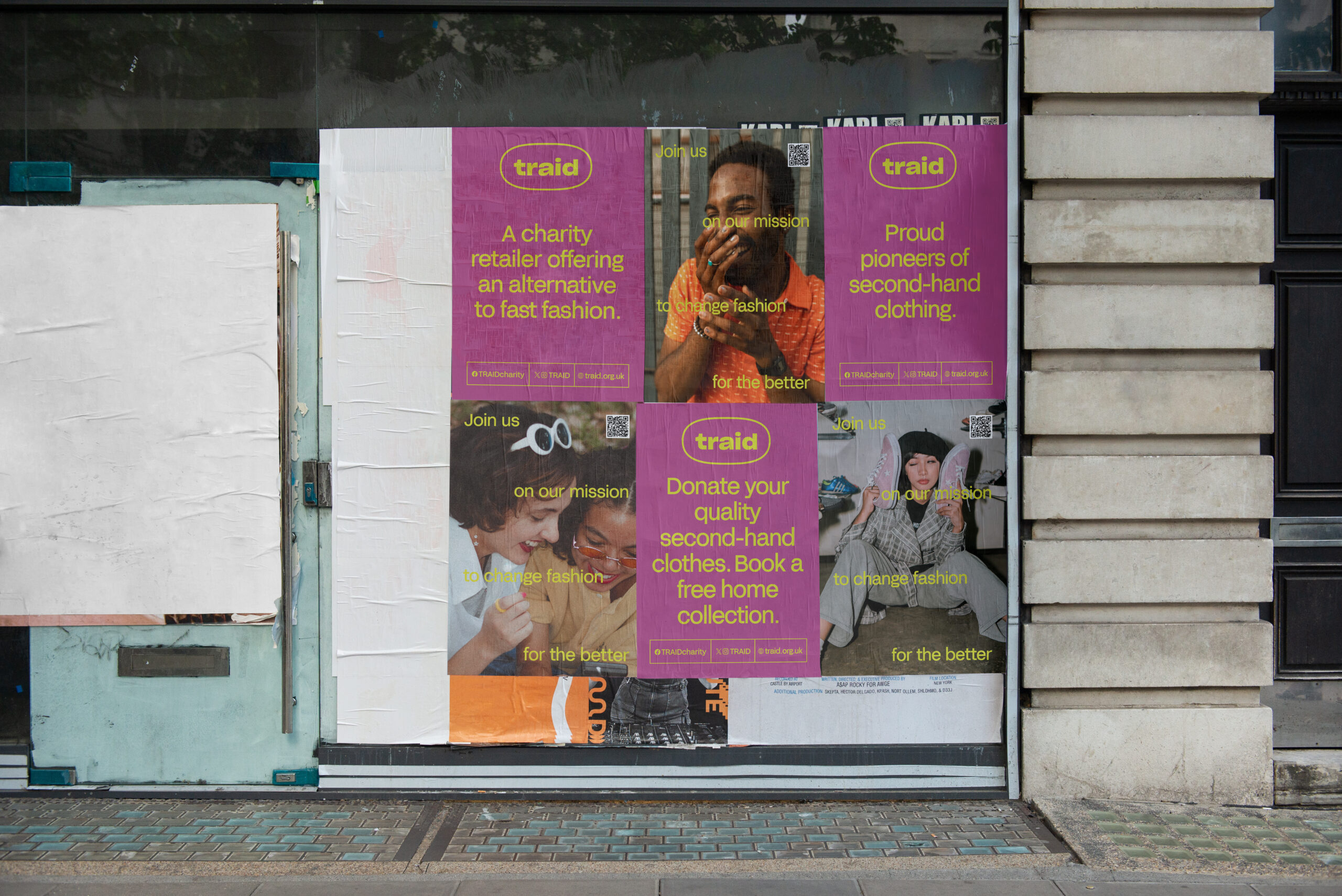
The Traid pill is a bold icon in its own right.
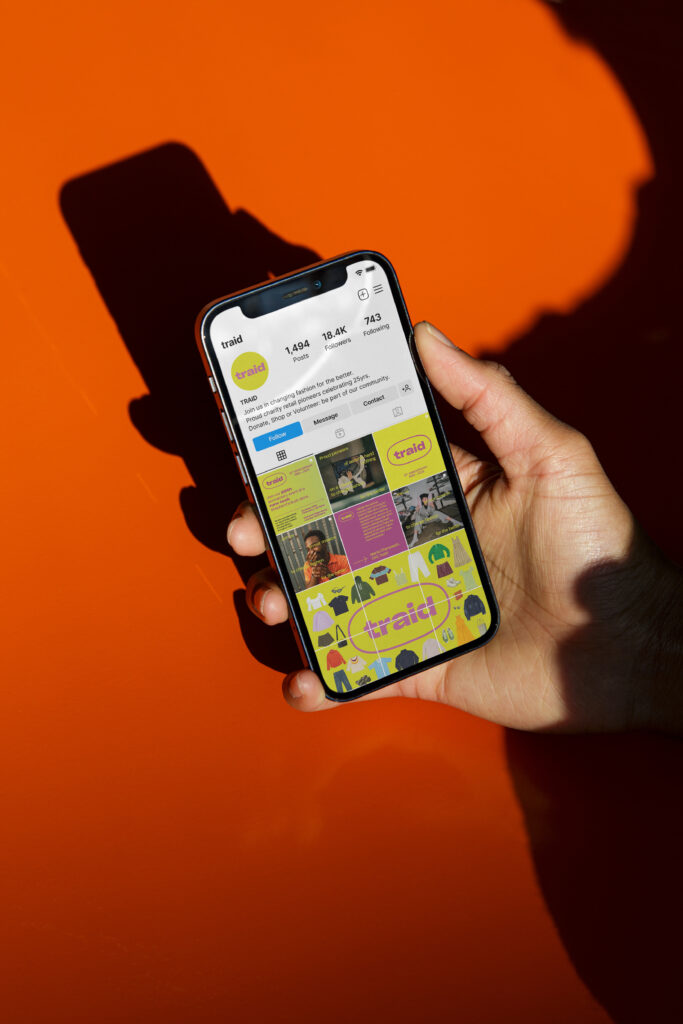
Traid’s signature green (which is widely recognised by followers of the brand) has been updated to be fresher and brighter, and is complemented by a vibrant and high contrast pink that brings an energy previously missing from the identity. Whilst a softer secondary palette supports and counterbalances the more expressive green and pink.
A new photography system brings together editorial reportage imagery with more energetic brand and product shots – that give focus / prominence to high-quality garments presented in contemporary collections – that can be cut-out and utilised in the style of fashion collages and moodboards.